
health collective

Design work: 2020
The Ask
Provide visual and UX design help to an existing Wordpress site that sells custom clothing
My Role
Comparative analysis with similar brands
Wireframes, information architecture, hi-fi specs, logo-design adjustment
sitemap, original

Current issues
The app opens on a homescreen that requires user to click on “shop” to go to the page where they can buy things. The way the site was coded makes the photo occasionally overflow beyond the button so client is potentially losing sales due to users’ inability to reach “shop” page
Site is fairly slow and it makes going from one page to another a painful process
Images on the desktop version are misaligned
Blog page has one entry and client doesn’t intend to add more
Users

Photos courtesy of Health Collective
AGES: 25 -35
GENDER: 80% identifying as men; 20% identifying as women; unknown amount identifying as non-binary
GENRE DESCRIPTORS: irreverent, counter-culture, art-school, street-art. Many customers are music enthusiasts. A few are indie-famous musicians.
PRIMARY USAGE: most users engage in site through their phone. Many linkages happen though Instagram. A friend of the client said, “Desktop is over.”
Site evaluation through lens of UX principles
https://lawsofux.com
doherty threshold
“Productivity soars when a computer and its users interact at a pace (<400ms) that ensures that neither has to wait on the other.”
According to this law, the site has to become faster and the distance between entering the site and being able to shop need to be closer
Removing this requirement for a user to click “shop” achieves one of the goals
Jakob’s law
“Users spend most of their time on other sites. This means that users prefer your site to work the same way as all the other sites they already know.”
There is no search feature. As the site grows, a search would become necessary.
Also, most ecommerce sites have an easily accessible “cart”. In this site, the cart is buried in the menu.
There is no sizing chart. Most ecommerce brands have charts that give users an understanding of how clothes will fit them.
Aesthetic usability effect
“Users often perceive aesthetically pleasing design as design that’s more usable.”
Subtle design tweaks on fonts, colors, alignment and spacing could go a long way to making this site more pleasing
comparative brand analysis
Been shill
This brand is one of the client’s primary inspirations for the current site. This, like current Health Collective site, opens from a photo with a single button
The goal of this opening page is most likely to communicate brand, however the advantage of this site is its speed. Clicking the button delivers user to shopping page in a fraction of a second
The audience for this brand is largely the same as the client’s
Born x raised
This brand is fairly famous. Most recently, they collaborated with the LA Dodgers
I was able to get a screen grab of landing page on Oct 31, however when I returned the next day to look at the detail views, the items were sold out
This group of artists pays minimal attention to web design. Their hype drives lines and sales at pop-up boutiques.
The fame of this group means users will put up with a sub-par web experience
supreme
This brand is more like the Nike of counter-culture. It’s not really subversive anymore. Hence they have a polished, brutalist website.
The wide selection of clothing requires categorization so it takes a few more clicks to get to the detail page of a shirt, for example.
One interesting thing about the sizing chart is that it functions as a popup on the mobile version and as a page on the web version
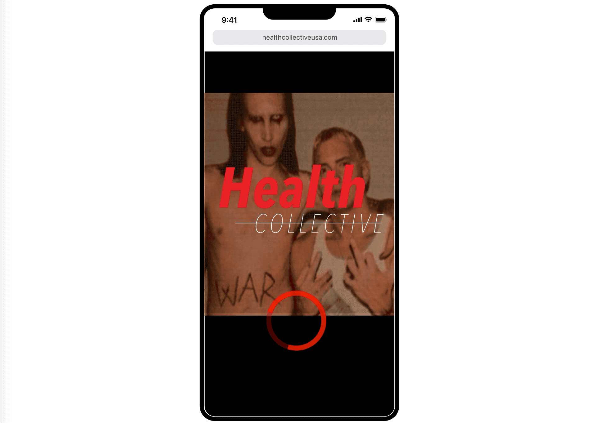
Designs
For this project, the scope of the design-work has to be modest. So I am focusing on simple changes that have a big impact. First, I removed the necessity of clicking on “Shop” button on the homepage and instead took the user straight to the “Shop” page. The original function of the homepage—to communicate brand—can be instead used as a loading animation for the Shop page. (See animation below).


next steps
We are still looking for a developer to help make the site faster.